Mapped D.C.’s Airbnb market with SQL, JavaScript, and Tableau. Revealed unlicensed rentals, commercial hosts, and clever workarounds to the city’s short-term rental laws.
Project Links
This project is, quite literally, close to home for me—I live in D.C., and it was built out of both personal interest and professional curiosity. It started as a bootcamp group project and quickly became a proving ground of firsts: first database built, first full-stack app, first time tying together maps and data stories. Patterns emerge if you dig—unlicensed listings, commercial hosts, and clever workarounds to short-term rental laws. I designed it as a tool anyone in the city could explore, whether you're curious about your block or the big picture.
Project Overview
This full-stack project analyzes the Airbnb market in Washington, D.C., combining backend and frontend technologies to deliver a robust data analysis platform. Listing data is stored in a PostgreSQL database, with a Python-based backend built first in Flask for its flexibility and later reimplemented in Django to explore a more structured, full-featured web framework. This progression allowed for deeper control over routing, authentication, and admin tooling.
On the front end, JavaScript drives interactive components—including a Leaflet map that visualizes listing density by neighborhood—while Tableau provides advanced data visualization, enabling users to explore key trends in the D.C. Airbnb market. Metrics such as average nightly rates, listing density by neighborhood, and occupancy rates are presented through a user-friendly interface and dynamic dashboards.
By combining backend engineering with intuitive visuals, this project empowers users to compare neighborhoods, track changes over time, and uncover meaningful patterns. It also serves as a demonstration of my ability to manage the full data lifecycle—from data ingestion and API design to frontend interaction and visual storytelling—across multiple frameworks and technologies.
Use two fingers to move maps
Gallery
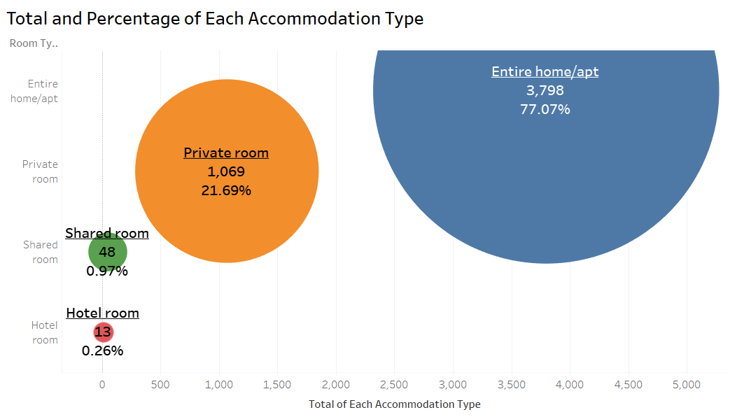 Rental Property Type: Bubble chart from Tableau showing that
entire home/apartment rentals make up over 75% of all
listings.
Rental Property Type: Bubble chart from Tableau showing that
entire home/apartment rentals make up over 75% of all
listings.
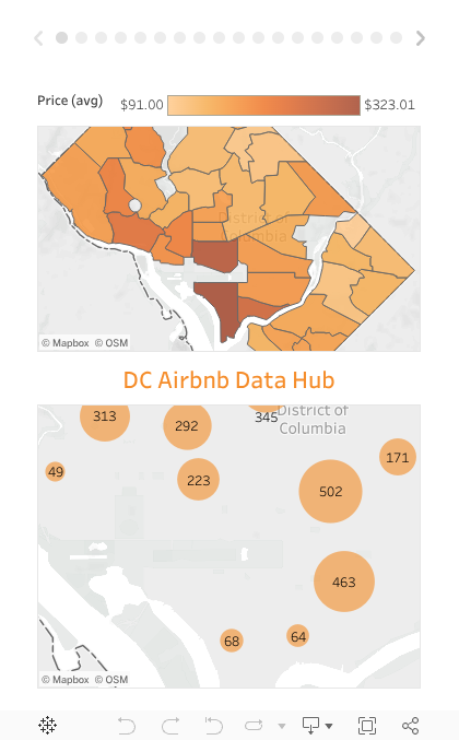
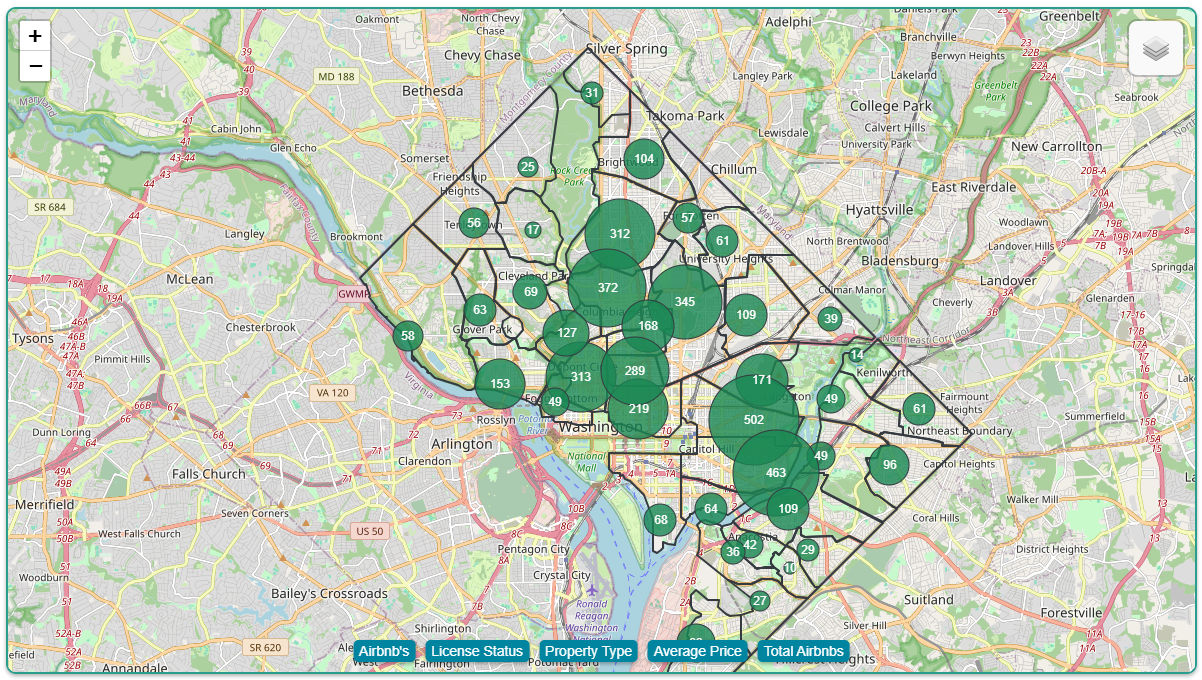 Neighborhood Bubble Map: Visualizing the count of AirBnB listings
by neighborhood, with the highest concentration near downtown
DC.
Neighborhood Bubble Map: Visualizing the count of AirBnB listings
by neighborhood, with the highest concentration near downtown
DC.
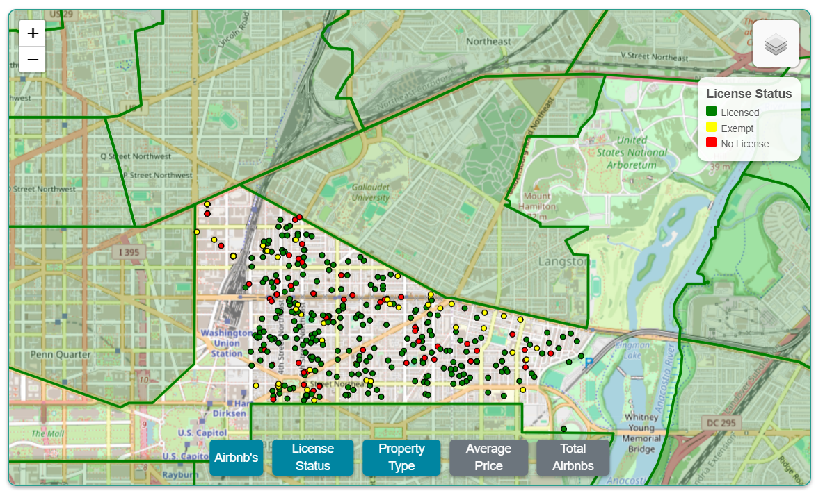 Licensing Status Map: Neighborhood-level map colored by license
status, highlighting a significant number of unlicensed
rentals.
Licensing Status Map: Neighborhood-level map colored by license
status, highlighting a significant number of unlicensed
rentals.
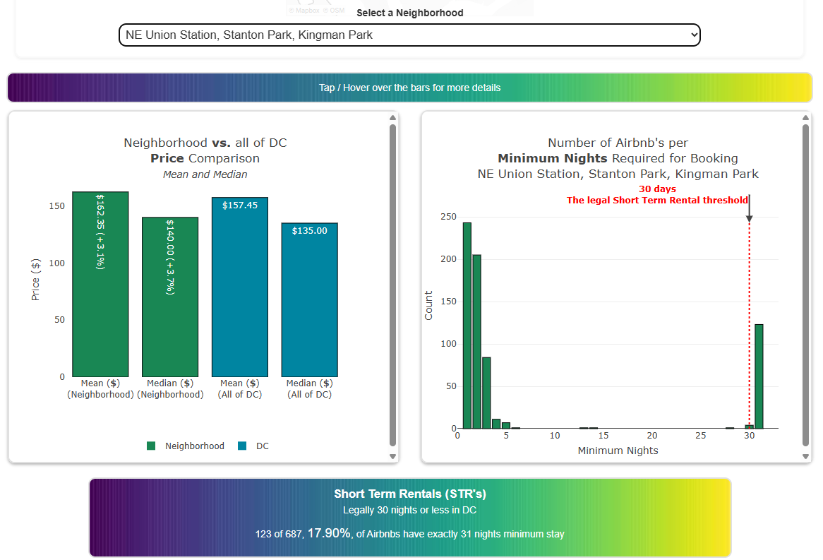 Web dashboard plots: Visualizing how each neighborhood’s mean and
median prices stack up against the city overall, and how minimum
nights drop sharply—spiking just after DC’s legal threshold for
short-term rentals.
Web dashboard plots: Visualizing how each neighborhood’s mean and
median prices stack up against the city overall, and how minimum
nights drop sharply—spiking just after DC’s legal threshold for
short-term rentals.
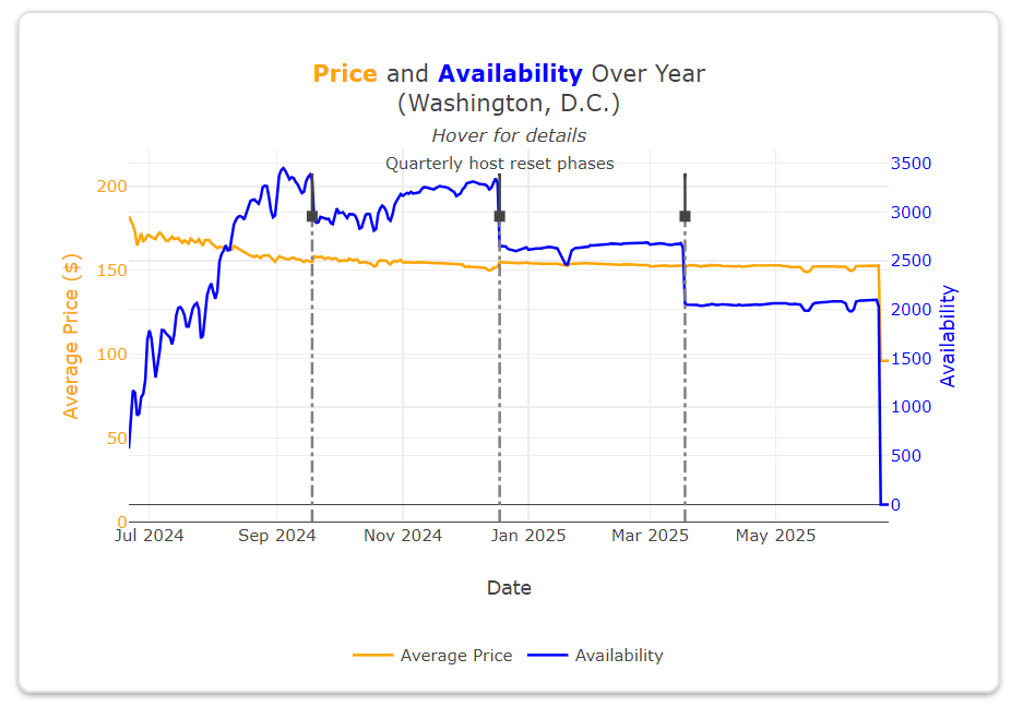 Price & Availability Trends (July, 2024): Plot showing stable
prices and increasing availability, with noticeable dips up to a
year out for major events like the inauguration and
graduations.
Price & Availability Trends (July, 2024): Plot showing stable
prices and increasing availability, with noticeable dips up to a
year out for major events like the inauguration and
graduations.
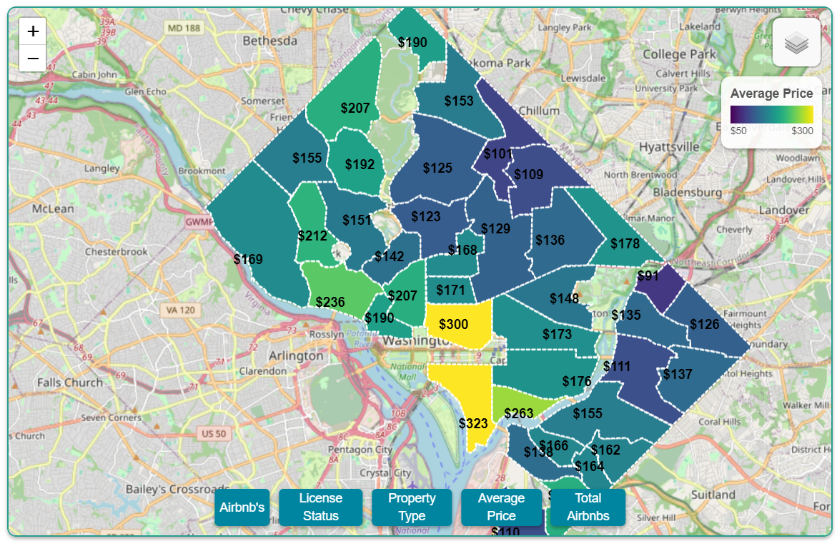 Price Choropleth: Average nightly price by neighborhood, with
downtown areas commanding the highest rates.
Price Choropleth: Average nightly price by neighborhood, with
downtown areas commanding the highest rates.
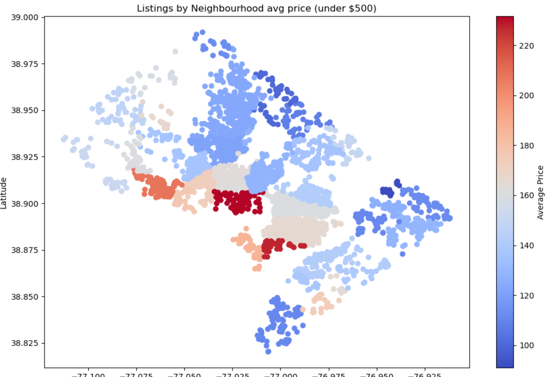 Average Price by Neighborhood: Python EDA plot comparing average
prices across neighborhoods—contrast with the polished web version
above.
Average Price by Neighborhood: Python EDA plot comparing average
prices across neighborhoods—contrast with the polished web version
above.
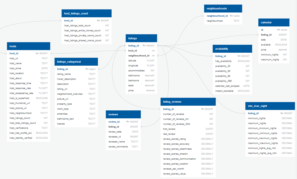 Entity Relationship Diagram: PostgreSQL ERD illustrating the data
engineering and structure behind the project.
Entity Relationship Diagram: PostgreSQL ERD illustrating the data
engineering and structure behind the project.
References
Dataset from the Inside AirBnB Project.